Blackmores Company Brand
NOTES
For more than 80 years, Blackmores has been a brand that represents something important – the best of natural health.
Blackmores conducted an intensive interrogation of their brand ensuring we understand what they stood for, their values and what makes them different so we can always communicate clearly, effectively and with consistency. The team provided us the wonderful opportunity to define, create and deliver the new Blackmores company brand. We set about developing the brand and providing a framework that can be used in every aspect of their business. It should inspire, not restrict creativity.
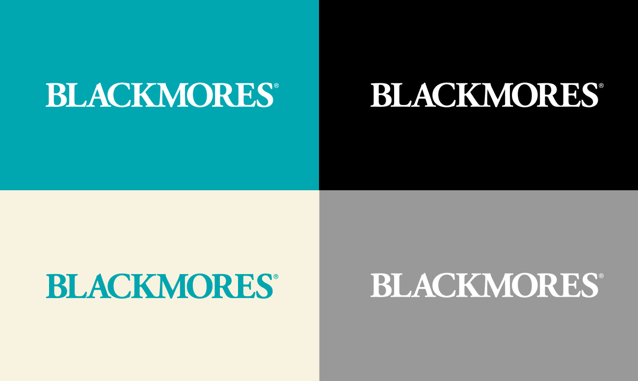
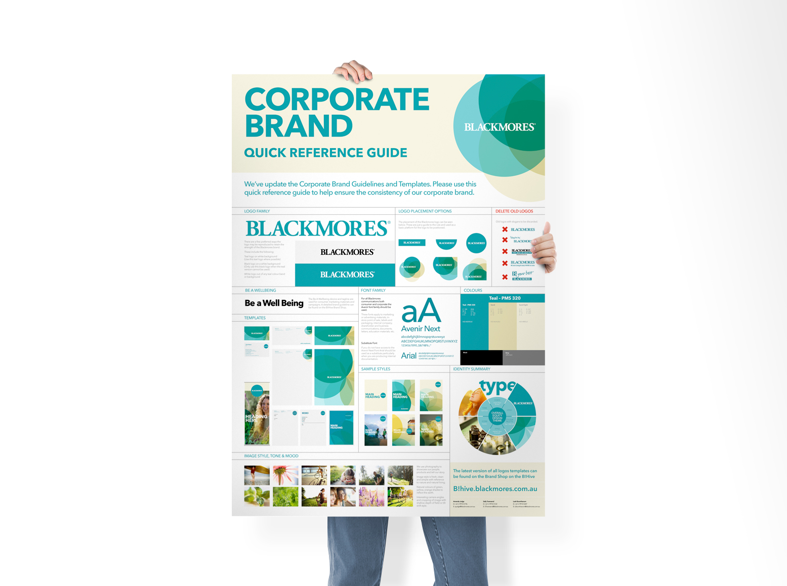
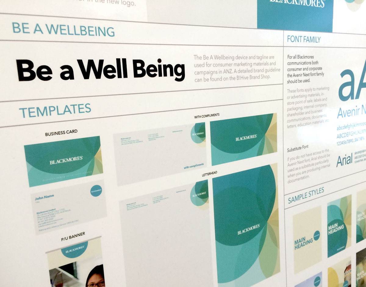
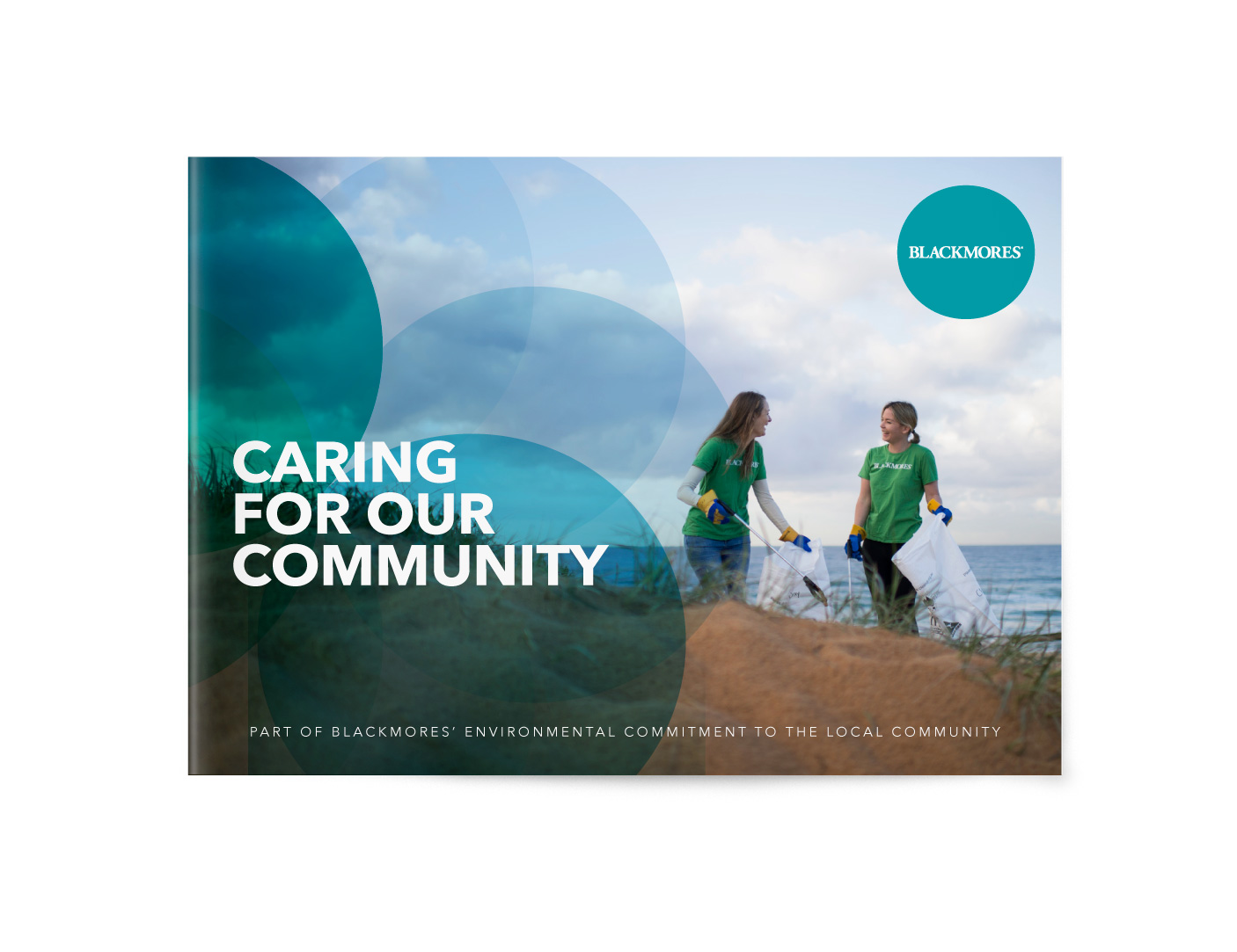
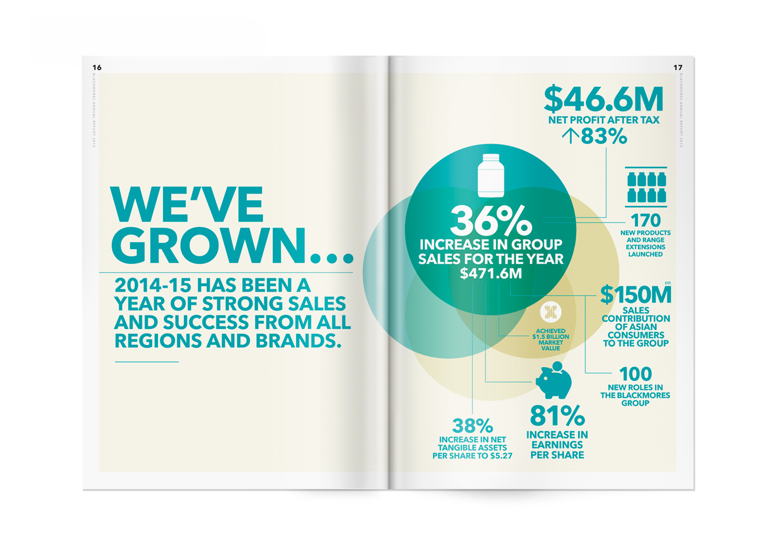
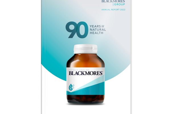
We reviewed all elements of their brand including, the new revised Blackmores Logo, all colour palettes, supporting graphics, image styles and typography – all based on the Xander 4 pillars principle.
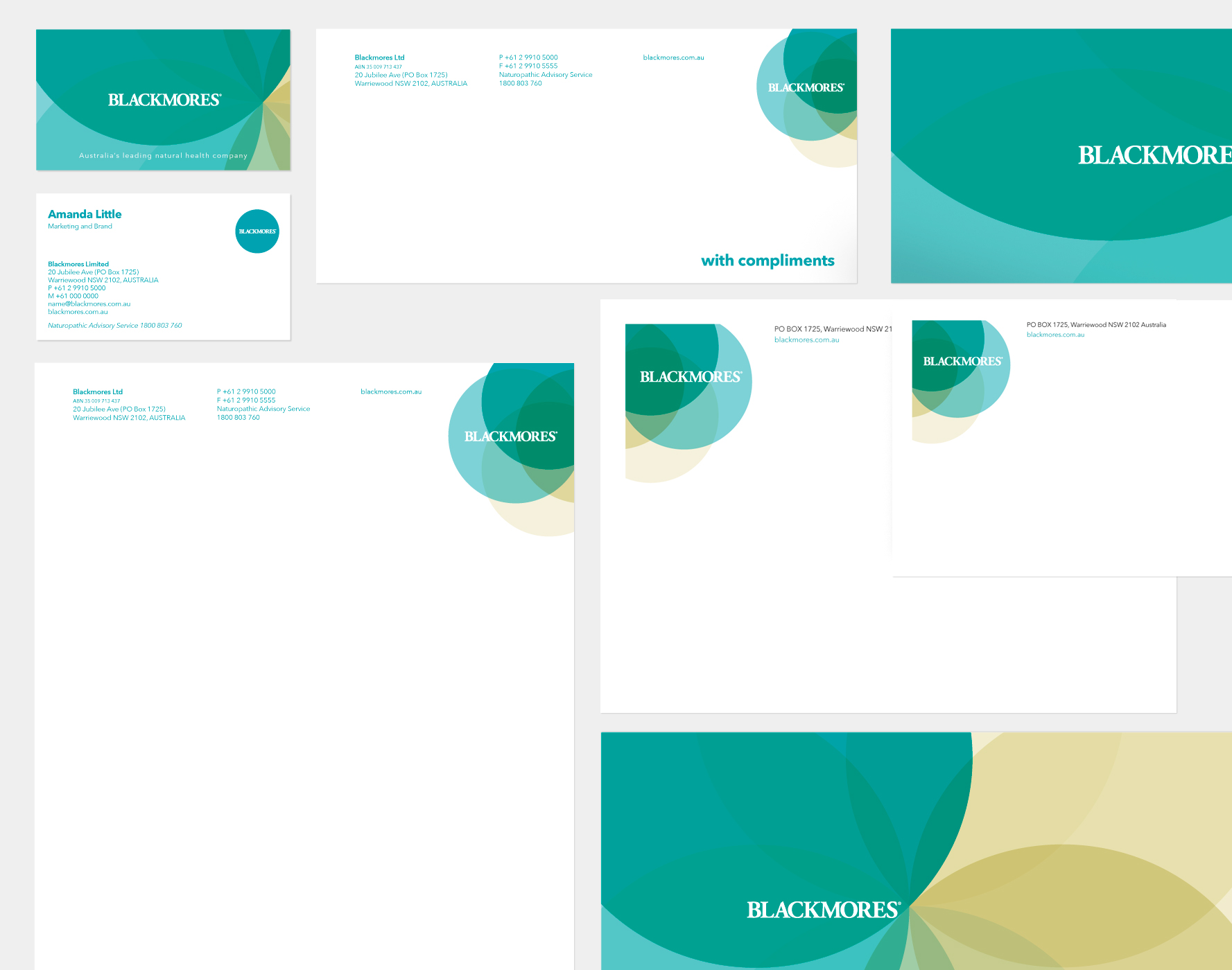
Both the corporate and retail brands share many attributes and visual elements. The corporate brand refers to all business and internal communications and we made sure some of the palettes produced would work together. Additionally we produced a comprehensive Brand Style Guide for all staff.
TASKS
Logo
Brand strategy
Brand Style guides
Design and Art Direction
Office Communications


